
Hoban Korean Restuarant
Creating a responsive website for a beloved local establishment.
Roles:
Product Designer, UX Researcher, and Visual Designer
Project Duration:
Three Weeks
Tools and Resources Used:
Figma, Whimsical, Canva, Adobe Color Accessibility Check, Unsplash, Pexels.
The project overview and background.
Hoban Korean Restaurant, owned by Kim and Young Lim, has served authentic Korean cuisine to the Twin Cities for 40 years. They have operated without a website for most of this time, only recently creating a Canva site that simply functions as an online menu.
A glance at their chaotically constructed Canva “site” is all it takes to see that Hoban would benefit greatly from a thoughtfully designed, fully functional website.
This was a passion project for me—I’ve been frequenting Hoban for over a decade. When I’m asked for restaurant recommendations, Hoban always makes the list.
I did not approach Hoban about this project as I do not possess the skillset or resources necessary to take these prototypes and develop them. This project remains a purely creative exercise but in the future, as my skills and circumstances change, I would love to do some pro bono work and make this site a reality for them.
I started my research by conducting user interviews because I was interested in learning:
A) What information are users looking for when they visit a restaurant’s website?
“I always want to review the menu before deciding to eat at a new restaurant.”
— Max
“I use Google Maps to browse, but I don’t trust the hours or menu available on Google to be accurate and up to date so I always check out their website. If a restaurant doesn’t have a website, I’ll likely choose to eat somewhere else that does.”
— Ella
“Their hours, their menu, to see if I can just walk in or if I need a reservation. Since I don’t eat meat, I want to make sure the food they offer fits with my lifestyle.”
— Asha
B) What do users wish that more restaurant sites would contain?
“I wish more restaurant’s online menus included the prices. Like, from a marketing perspective I understand why they don’t, but knowing how much a meal will cost really influences my decision to eat there.”
— Madeleine
“My life would be so much easier if restaurants had something to display how long of a wait it is to get a table. One place I eat at has a waitlist instead of reservations and I like being able to see how much longer it will be until I’m seated.”
— Emily
“Please can including basic dietary information on a menu become the industry standard. Several of my friends and family members have dietary restrictions and I don’t want to accidentally take them out to a place where they can’t eat anything. ”
— Divya
To synthesize my interview notes, I created an affinity map.
I initially grouped my notes by the questions they responded to (the smaller headings.) Then I combined those into the three sections you can see above.
Laying all my notes out made it clear that users share a general idea of what they believe restaurant sites should contain. They also had suggestions for information they struggled to find. They wished more restaurants would share online such as menu pricing and dietary information or estimated wait times for a table.
With the interviews fresh in my mind, I moved on to competitor analysis.
Once I grasped what users wanted from restaurants’ websites, I visited the sites of other Korean restaurants in the Twin Cities to understand industry expectations and see how these establishments chose to portray themselves.

My analysis was more extensive than you see on the left, but this section was the most informative for my project.
I created a list of metrics based on the results of my user interviews. As you can see, none of Hoban’s direct competitors met every benchmark.
This is a terrific opportunity for Hoban to stand out from the pack and draw more business.
To summarize the results of my user research:
The users I interviewed felt like every restaurant should have a website and mentioned that the presence or absence of a website greatly factors into their decisions when choosing a place to eat.
Users don’t ask much from restaurant websites. They want to find the information they desire without any hassle: what food is served, what is in that food, how much the food costs, what time the restaurant is open, if they need a reservation, or how long the wait is if they were to walk in.
Identifying the problem, and defining the product.
What problem will this product solve?
Users expect restaurants to have websites. Creating one for Hoban will help them meet users’ expectations and draw more customers.
Who will this product benefit?
1. The restaurant. A website will help draw in more customers and give them a positive first impression before patrons ever walk through the doors.
2. Potential customers. A website will inform their decision to dine there, providing them with the information and resources they need.
Who is the primary user of this product?
This product targets potential and returning customers. The user persona, specifically, is folks in the Twin Cities who are curious about Korean cuisine and are deciding where they should dine to try it.
After synthesizing my research results I outlined the project’s goals and crafted problem statements:
A) How might we help people curious about Hoban Korean Restaurant find the information they seek online?
B) How might we create an online presence for Hoban Korean Restaurant that accurately portrays its brand values and provides users with easily accessible and relevant information about the establishment?
With these priorities in mind, I started constructing the framework for Hoban’s website with a sitemap and user flow.
I wanted to make the website simple and straightforward, ensuring users could find the information they sought
To make the site as intuitive as possible, I browsed a dozen restaurant websites, noting what they had in common—what users were likely to expect from a restaurant’s site. My goal was to provide expected information following an established pattern. What would make the site stand out, and reflect who Hoban was, would be the UI choices made later on.
I crafted the user flow imagining I were the persona, visiting this site to determine if I want to eat there. I asked myself: If I am the user, what information do I need to make this choice and how do I go about finding it?
There were many possible paths I could take to get the information I needed, this flow captures some of those directions, but there are many others not included—the combinations would be too numerous, likely overwhelming the flow and decreasing its usability as a guide during the design process.
Now that I knew what pages and information the site needed, I began wireframing.
I knew several of the site’s pages would be very simple (contact us, hours, gallery, etc.) With this in mind, I spent my time sketching the home and menu pages, knowing these would be the most complex. Whatever pattern I decided on for these two would determine all the others.

Desktop Ideas 1

Desktop Ideas 2

Mobile Ideas
With my ideas out on paper, I jumped into Figma to create mid-fidelity screens for usability testing.
Wanting to be as efficient as possible, I decided to create mid-fidelity wireframes for the desktop viewport only. For previous responsive design projects, I typically began with the smallest viewport and worked my way up. I took this opportunity to try the reverse of that process. After experiencing both, I can say that my preferred method will be determined by the content and type of the product being developed.

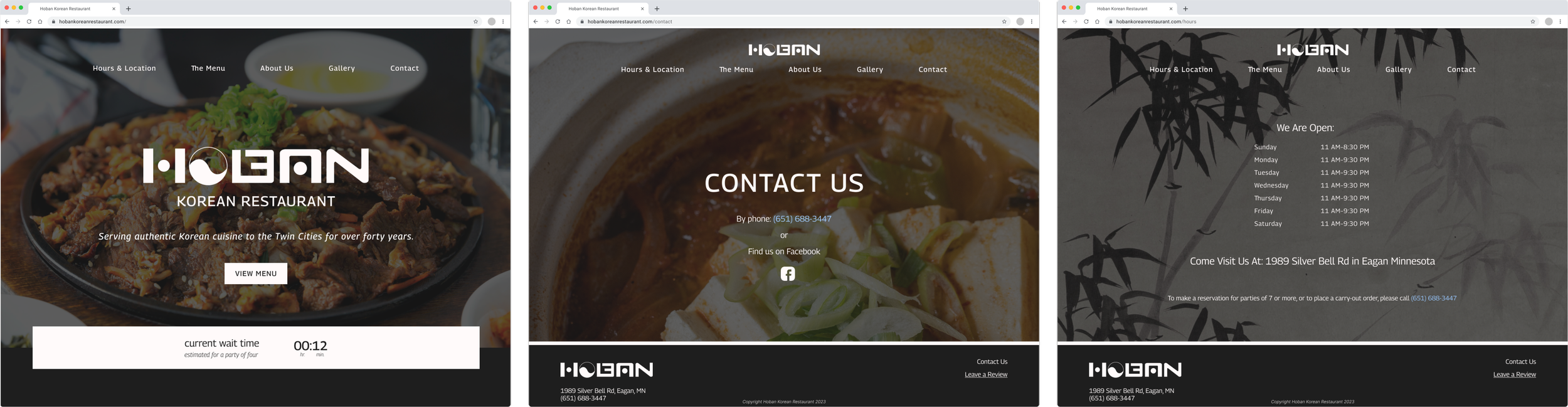
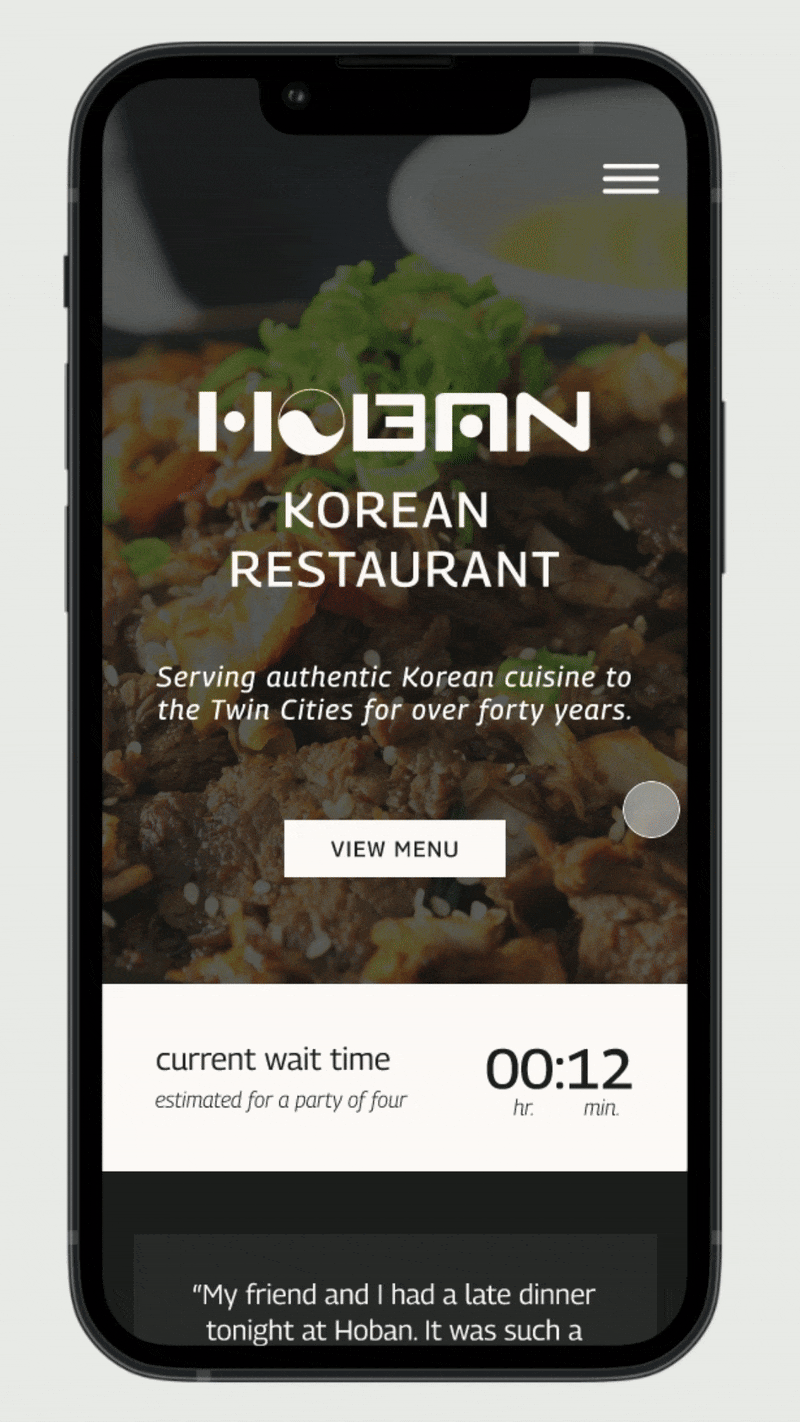
Home Page

Home Page with Navigation

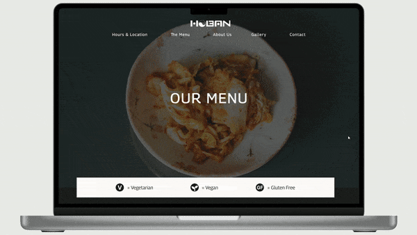
Menu

About Page

Contact Page

Gallery
My early stage usability testing.
In addition to these points, many of the decisions I made as I iterated and moved into high fidelity were informed by my observations of these tests—just making a few tweaks to make the experience even smoother. Conducting usability testing at the mid-fidelity stage saved me a lot of time later. Making large-scale changes is far simpler before UI elements are added.
What I asked:
“Imagine you are looking for a place to eat dinner and you click on Hoban’s website. Browse this prototype and see if Hoban sounds good to you.”
Actionable feedback I received:
“I like the hamburger menu on a mobile site, but there aren’t a lot of pages to choose between, maybe a normal navigation menu at the top would feel more natural for desktop.”
“Everything is where I want it to be, if that makes sense. When I tried to find something, it was in the first place I looked—except the page listing the hours. I couldn’t find that.”
In addition to establishing a website, I wanted to refresh the restaurant’s branding.

First, I took this screenshot of the most recent logo uploaded to Hoban’s Facebook page and put it in Figma.

Second, I used the pen tool in Figma to trace over the screenshot and create a vector copy. The first thing necessary to bring this logo into the current decade was to remove the reflective effect.

Finally, I already knew I would be using hero images on every page and that the overall website was going to be dark-themed. I decided to render versions in black and white. This way I wouldn’t have to worry about coordinating the hero photos with the logo’s colors. The white version of the logo is the one present throughout the final design.
Designing the UI.
The inspiration.


These are photos of Hoban’s pre-pandemic menu. As I mentioned, their menu is currently available via a Canva site. Patrons scan the QR codes on the tables to access the menu. Physical menus are no longer handed out.
These old menus were my primary inspiration for the UI design of the site. I wanted to ensure the new website felt true to the established Hoban brand.
The result.
I chose a near-black to serve as the primary color and background of the site. The website menu’s structure mimics the old menu, but with a sleeker color palette and uniformly displayed images of select menu items.
With all the pieces ready, it was time to put together the high-fidelity prototypes.
I prefer to spend more time adjusting the design in the mid-fidelity stage, this makes creating high-fidelity screens as easy as putting together a puzzle after sorting the pieces.
I sourced the hero images from Unsplash and Pexels, and the images of menu items are user-uploaded photos to Google’s image gallery of Hoban Korean Restaurant.

Prototypes complete, I was ready to get a second round of feedback from more usability testing.
I used the same methods and questions this time as I did in my usability tests at the mid-fi stage. This helped me understand how the changes I’d made from that feedback succeeded/failed.
Users were asked to complete the task with the desktop prototype first and then the mobile version.
I considered the task successfully completed if users navigated the prototypes with little frustration and minimal trial-and-error. This was based on my observations of their interactions during the testing and on the conversations I had with participants afterward.
The task:
“Imagine you are in the process of deciding what restaurant you want to try this weekend. You click on Hoban’s website after a quick Google search. Use the site to see if Hoban is what you will choose.”
The results:

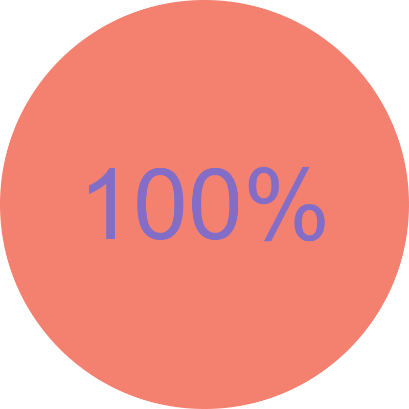
task completion mobile
task completion desktop
User feedback:
“I like how most of the pages are framed at the beginning, the white bar at the bottom with meaningful information before you scroll is very pleasing to the eye.”
“I wish I could change how many people are in my party so it updates the wait time. I would also like the white bar to be added to the pages that don’t have it yet.”
“The layout of each [mobile] page is very similar to the [desktop] page, with no major drawbacks. I like that.”
“The font of the mobile menu is too small for me to read, I’d need most of it to be larger.”
With the usability tests so successful, there were only a few minor iterations I made to the final design.
Before.
This is the mobile menu users interacted with during testing. The body font is 12px.
After.
I increased the body text font size to 14px in response to user feedback.
Working on the menu, especially the mobile version, and managing so much text was one of the more challenging aspects of this project. Figuring out how to balance legibility with keeping the page at a relatively reasonable length given its content took some time, but I am happy with the result.
In conclusion.
Of all the projects I’ve done, this one is closest to my heart. Creating a fully responsive website was an invigorating challenge. I’ve never worked with such large sections of text before and learning how made me a stronger designer. It was also a puzzle in terms of branding: what to keep the same, what to update, and how to bring them up to date while maintaining the feeling that has kept customers coming back for over forty years.
It is because of these challenges that this project has been the most impactful for me as a designer. I faced these obstacles and learned how to navigate them and I’m proud of how this website has turned out. In the future, when my resources and skills allow, I hope to approach the restaurant and see if they would like me to develop it for them.